勝光燭品 / Sheng Guang
30年製燭工藝,薪火相傳的優質燭品
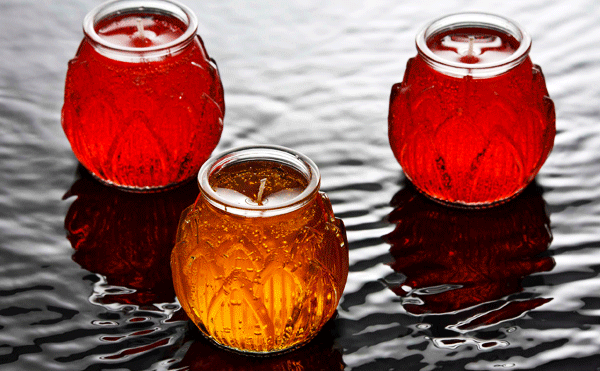
勝光蠟燭工廠成立於 1982 年,秉持「創新、環保、生活」的原則,以祭祀用蠟燭為主力商品,通過 SGS 檢驗合格,擁有超過 30 年的製燭經驗,已傳承至第三代經營。在削價競爭且品質參差的市場中,堅持「不添加香精」,採用「植物性原料」與「植物纖維棉芯」製成天然優質燭品,將燃燒時對身體與環境產生的負擔降到最低,讓消費者在點燈祈福的過程,增添一份安心與保障。
Sheng-Guang had devoted in making candle for more than 30 years, especially concentrated on the worshipped candle made from shortening and jelly. At present, it had been passed down to the third generation. In this low-price competition market with various quality level, Shegn-Guang insists on making high quality candle with vegetable material and vegetable fiber wick that can reduce the hazard to user’s health and the environment. It brings a safety and insurance to users in the blessing for luck with a burning candle.
Sheng-Guang had devoted in making candle for more than 30 years, especially concentrated on the worshipped candle made from shortening and jelly. At present, it had been passed down to the third generation. In this low-price competition market with various quality level, Shegn-Guang insists on making high quality candle with vegetable material and vegetable fiber wick that can reduce the hazard to user’s health and the environment. It brings a safety and insurance to users in the blessing for luck with a burning candle.
|
|
發掘價值 讓傳統產業蛻變升級
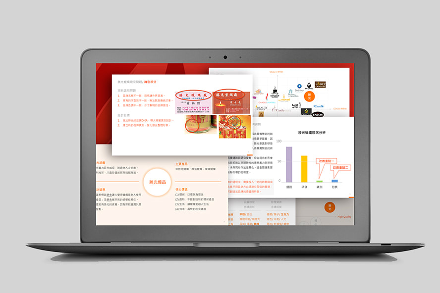
於實地訪談過程發現,識別系統與包裝未經整合的情況下,即使擁有產品類型多元與技術的優勢,也無法真正的聚焦品牌價值,同時面臨產品管理的問題!
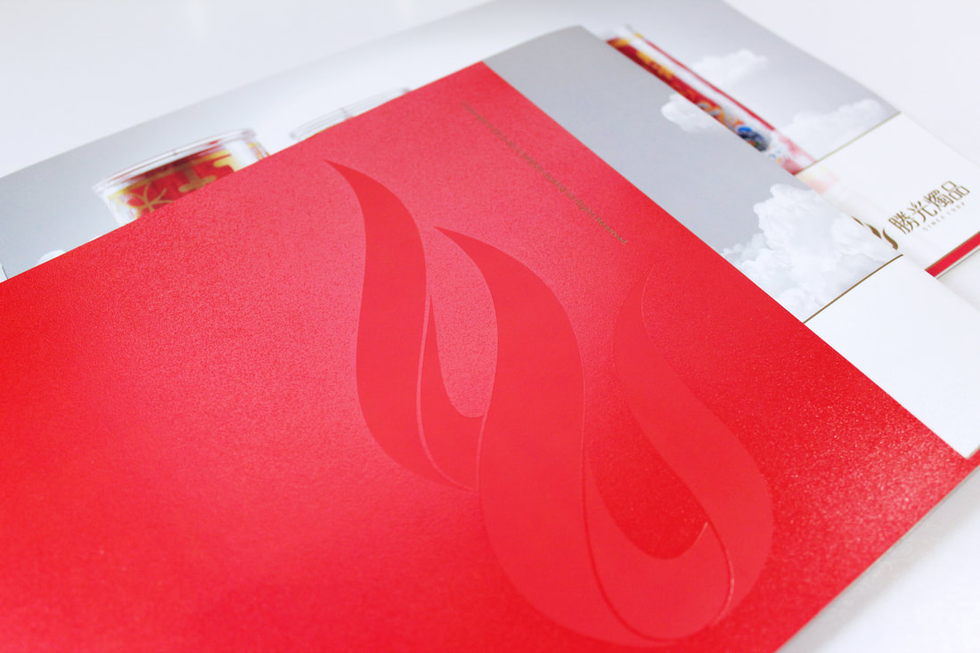
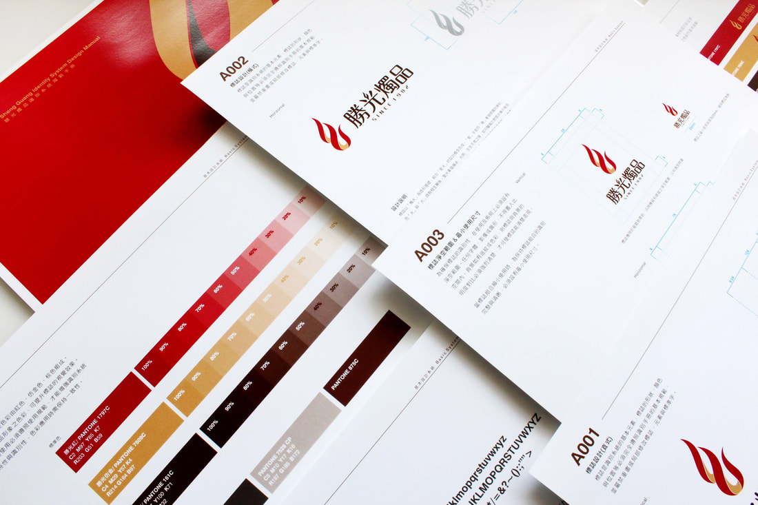
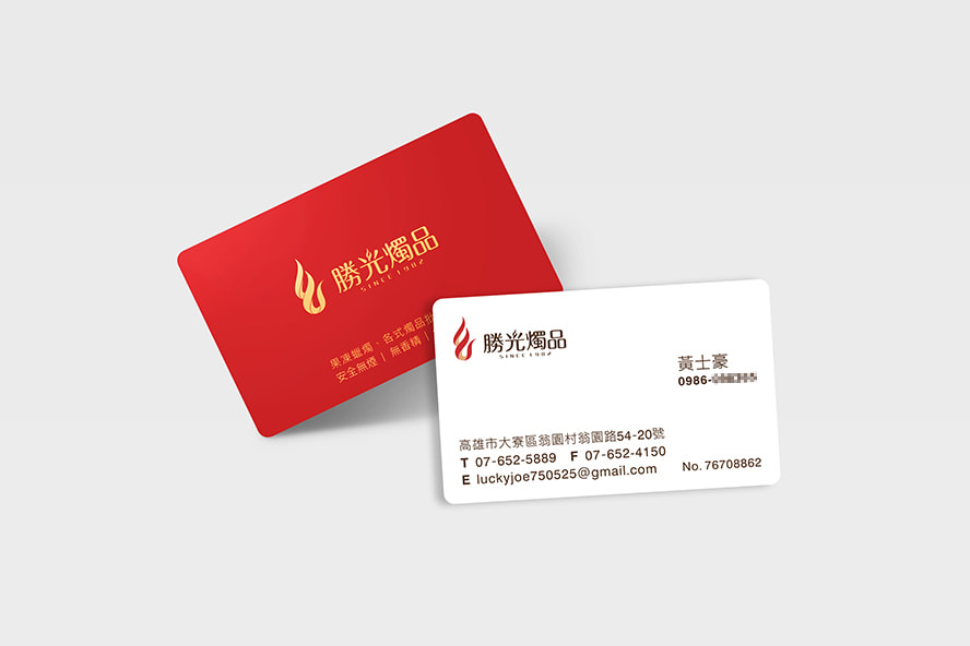
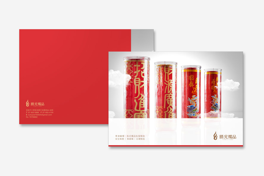
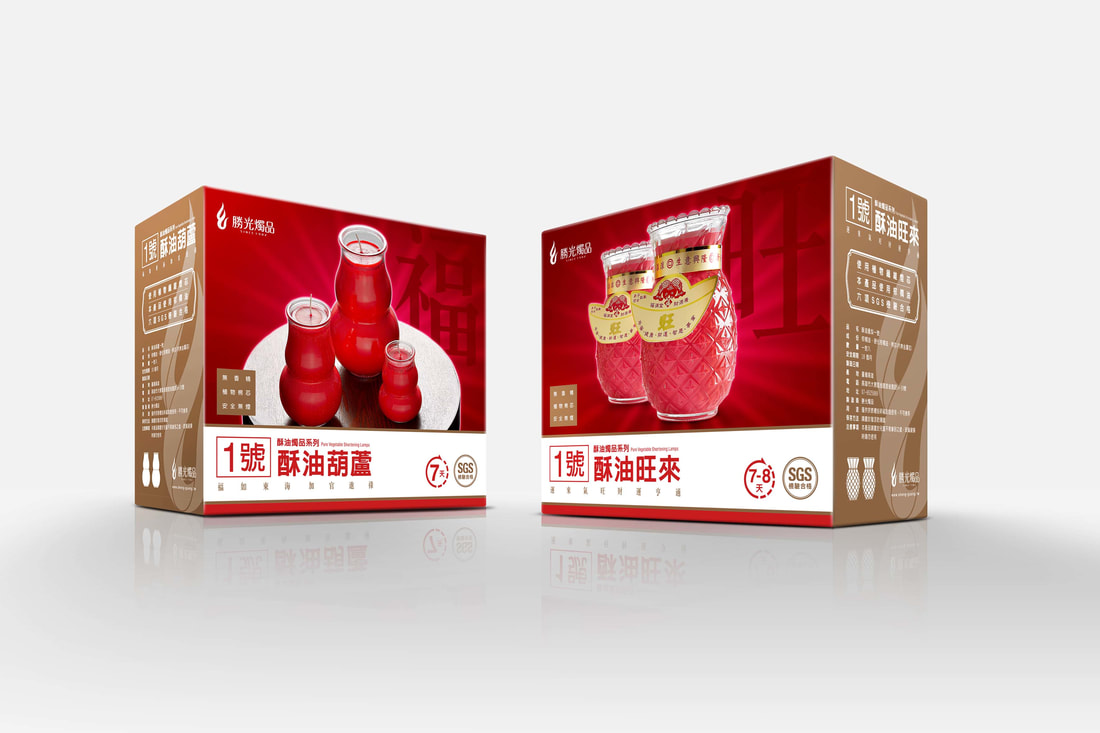
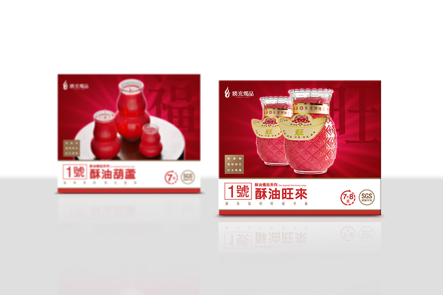
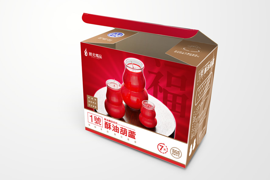
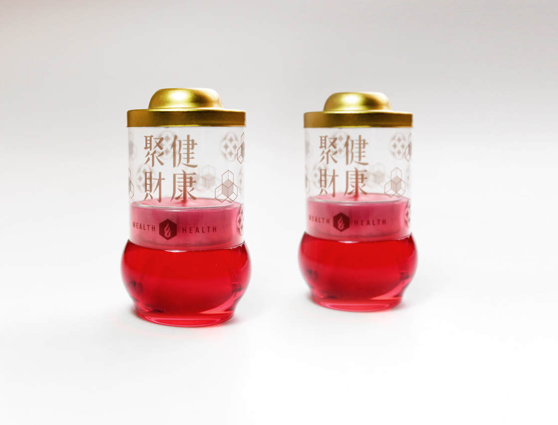
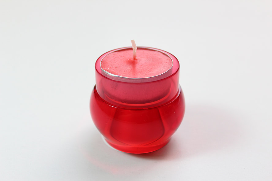
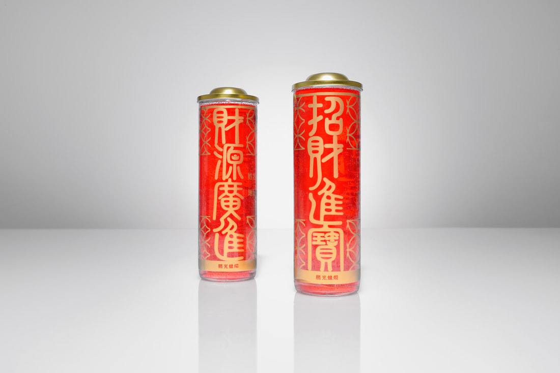
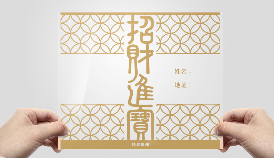
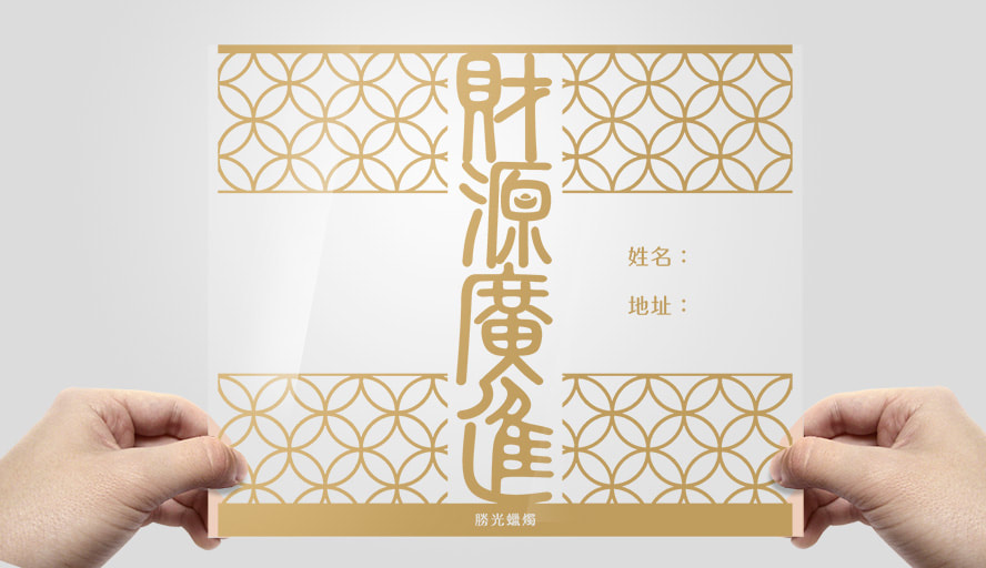
正負一瓦協助品牌命名及品牌定位工作,發掘勝光燭品的產品差異與原有優勢,並進行識別系統設計,使品牌形象建立一致性,並規劃一系列的產品拍攝作業。品牌標誌以「燭火」為造形基礎,結合「聖火」的設計概念而成。「聖」音同「勝」,象徵榮耀與勝利;而「火」與「光」具有相生關係。聖火有傳承、光明、生生不息之意;如同蠟燭於燃燒淬煉中展現卓越的生命力,寓意著永續經營的決心。以「紅色」代表積極創新;「金色」為品質保證,突顯勝光燭品的品牌承諾與價值。
The logo’s flame mode design comes from the concept of the Sacred Fire. The sound of “Sacred” is the same as the word “Win”in Chinese with the symbol of glory and winning. Addition, the fire and light exist with an intergenerational relationship. The vivid flame of a burning candle is like a sacred fire represents the symbol of inheritance, lightness, and endlessness. These symbols imply the determination of sustainability of business. For the color selection, the red color represents the symbol of positive innovation; the gold color represents the insurance and value of the brand.
於實地訪談過程發現,識別系統與包裝未經整合的情況下,即使擁有產品類型多元與技術的優勢,也無法真正的聚焦品牌價值,同時面臨產品管理的問題!
正負一瓦協助品牌命名及品牌定位工作,發掘勝光燭品的產品差異與原有優勢,並進行識別系統設計,使品牌形象建立一致性,並規劃一系列的產品拍攝作業。品牌標誌以「燭火」為造形基礎,結合「聖火」的設計概念而成。「聖」音同「勝」,象徵榮耀與勝利;而「火」與「光」具有相生關係。聖火有傳承、光明、生生不息之意;如同蠟燭於燃燒淬煉中展現卓越的生命力,寓意著永續經營的決心。以「紅色」代表積極創新;「金色」為品質保證,突顯勝光燭品的品牌承諾與價值。
The logo’s flame mode design comes from the concept of the Sacred Fire. The sound of “Sacred” is the same as the word “Win”in Chinese with the symbol of glory and winning. Addition, the fire and light exist with an intergenerational relationship. The vivid flame of a burning candle is like a sacred fire represents the symbol of inheritance, lightness, and endlessness. These symbols imply the determination of sustainability of business. For the color selection, the red color represents the symbol of positive innovation; the gold color represents the insurance and value of the brand.
按一下這裡來編輯。
|
|
|
|

|
|
|
|
● 客戶名稱/ 勝光蠟燭廠
● 品牌名稱/ 勝光燭品
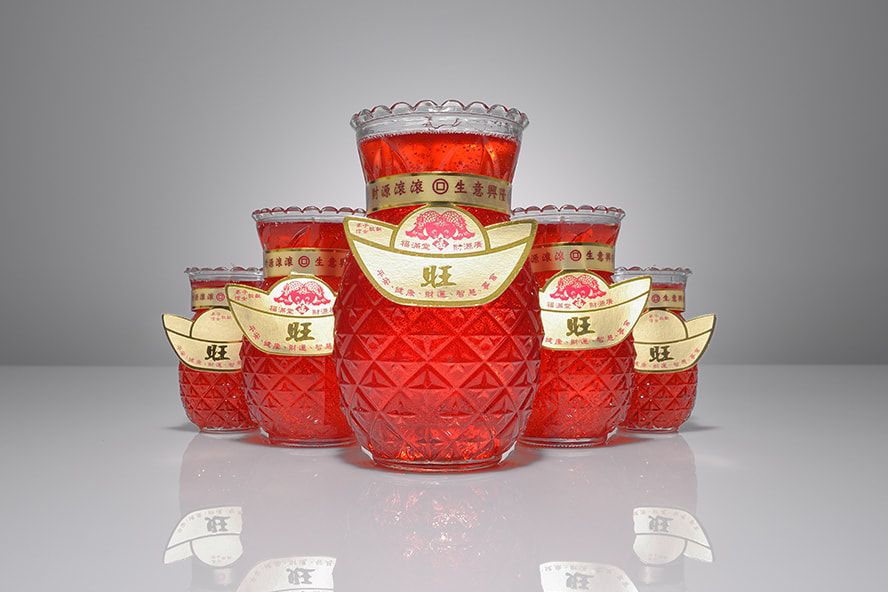
● 專案項目/ 品牌溝通、品牌定位、品牌識別系統、視覺指導、影像規劃與拍攝、包裝設計、型錄設計、產品設計、打樣製作
● 品牌名稱/ 勝光燭品
● 專案項目/ 品牌溝通、品牌定位、品牌識別系統、視覺指導、影像規劃與拍攝、包裝設計、型錄設計、產品設計、打樣製作
MORE WORKS
德瑞格/ ULTITEC
|

聯合骨科器材/ UOC USA
|
勝光燭品/ Sheng Guang
|

鴻達積/ Hometouch
|