正河源 Chain Headway
轉動世界每一天 成就科技新動力 Spinning the world everyday Innovating the new scientific power
正河源成立於1991 年,以研發與行銷機械配件、銑床精密刀具、銑床夾具為主,其產品多達 22,000 多件。正河源以「快速解決客戶的加工需求」為品牌承諾,引進領先業界的「CCVP 通路加值模式」,為客戶端進行價值鏈的整合,在軟硬體、服務提升的同時,也由正負一瓦為正河源量身規劃全新的企業品牌形象。
Chain-Headway Machine established in 1991, focused on developing and selling accessories, precise milling tools, milling collets, and had over 22,000 marketable quality products. At present, to provide an express solution of processing inquiry to customer. Chain-Headway Machine pioneers to introduce CCVP Value-Added Platform to integrate all the business channels. Meanwhile, to upgrade facility and enhance the quality of service, Chain-Headway Machine decides to entrust POSINGEGA DESIGN to make an exclusive project to optimize the brand image.
Chain-Headway Machine established in 1991, focused on developing and selling accessories, precise milling tools, milling collets, and had over 22,000 marketable quality products. At present, to provide an express solution of processing inquiry to customer. Chain-Headway Machine pioneers to introduce CCVP Value-Added Platform to integrate all the business channels. Meanwhile, to upgrade facility and enhance the quality of service, Chain-Headway Machine decides to entrust POSINGEGA DESIGN to make an exclusive project to optimize the brand image.
|
|
並肩策動品牌定位與轉型
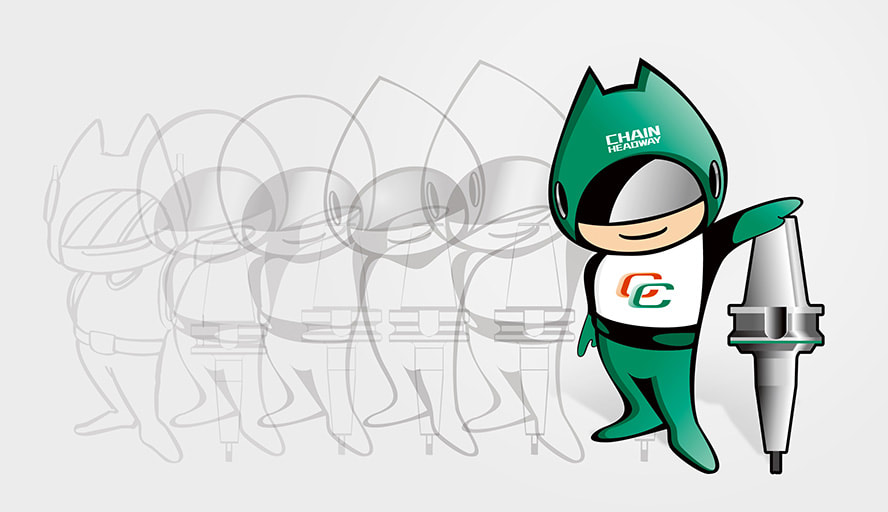
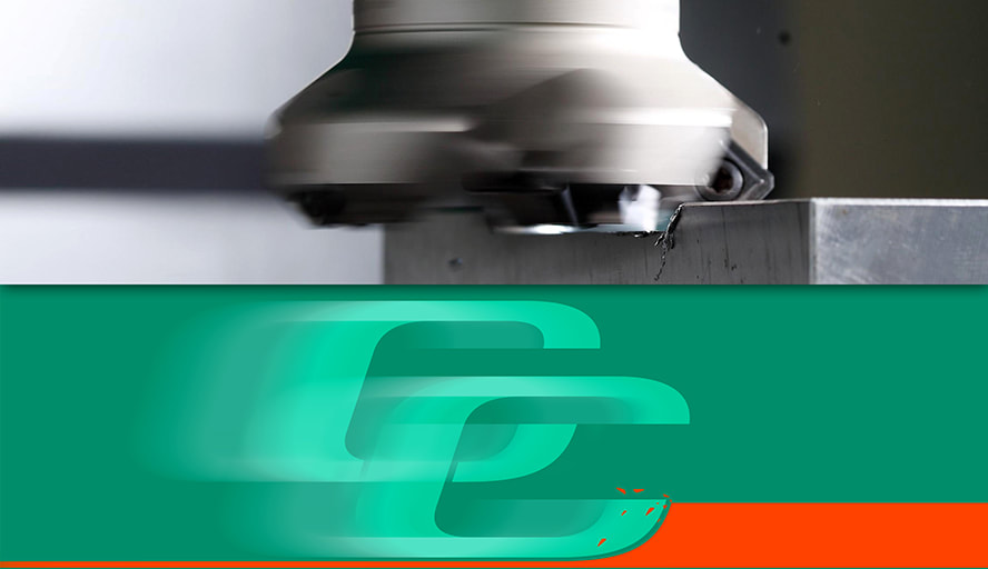
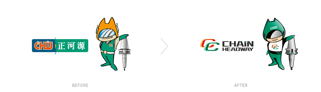
新標誌造形由兩個「C 」字結合,綠色的 C 代表正河源 (Chain-headway)、CCVP;橘色的 C 代表客戶 (Customer)、合作 (Cooperation)。如同正河源秉持團隊合作的信念,與顧客建立密切的合作關係,結合通路加值平台,提供全新服務品質,成為顧客信賴的夥伴。將機械刀具「轉動、切削」的形態,轉化為品牌輔助圖形,大幅提升企業品牌的識別度與一致性。
The Chain-Headway Machine logo consists of two letters “C”. One in green is for "Chain headway", "CCVP", and another in orange is for "Customer", "Cooperation". The logo design is including Chain-Headway Machine’s philosophy such as the team work sprit, to build up the close relationship with customer, to integrate Channel-Value-Added-Platform, to provide better service and to be a trusted partner to customer.The spinning and cutting motion of tooling are involved into the logo design to enhance significantly the brand’s visibility and accordance of production.
|

|
|
|
|
● 客戶名稱/ 正河源股份有限公司
● 品牌名稱/ Chain Headway
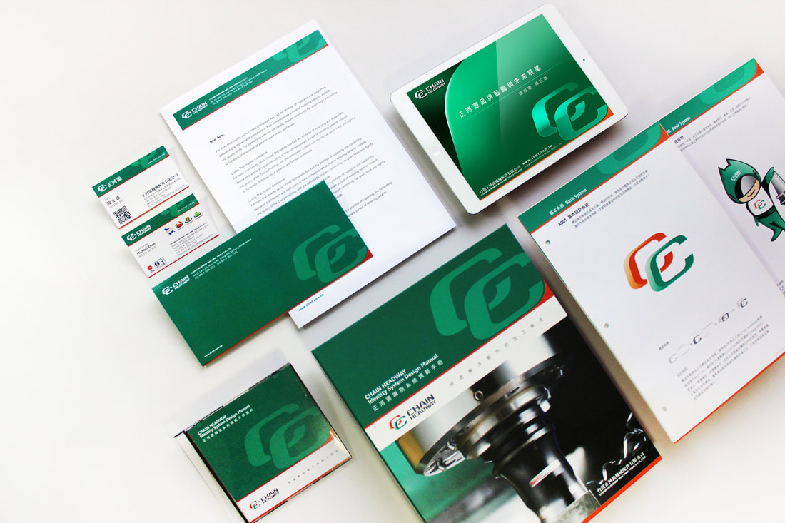
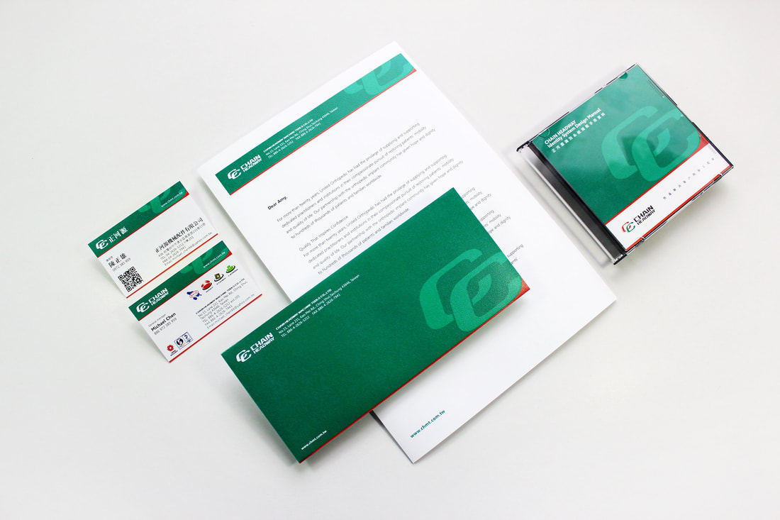
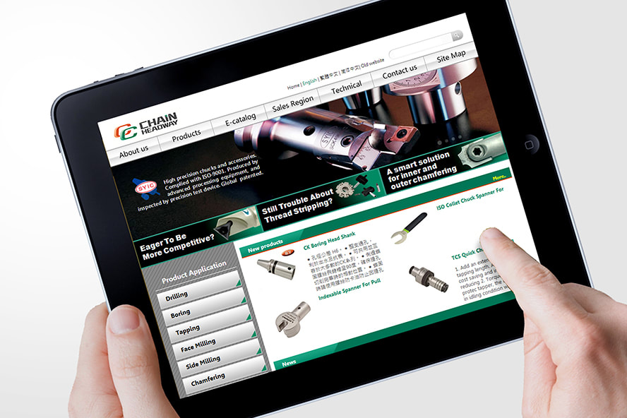
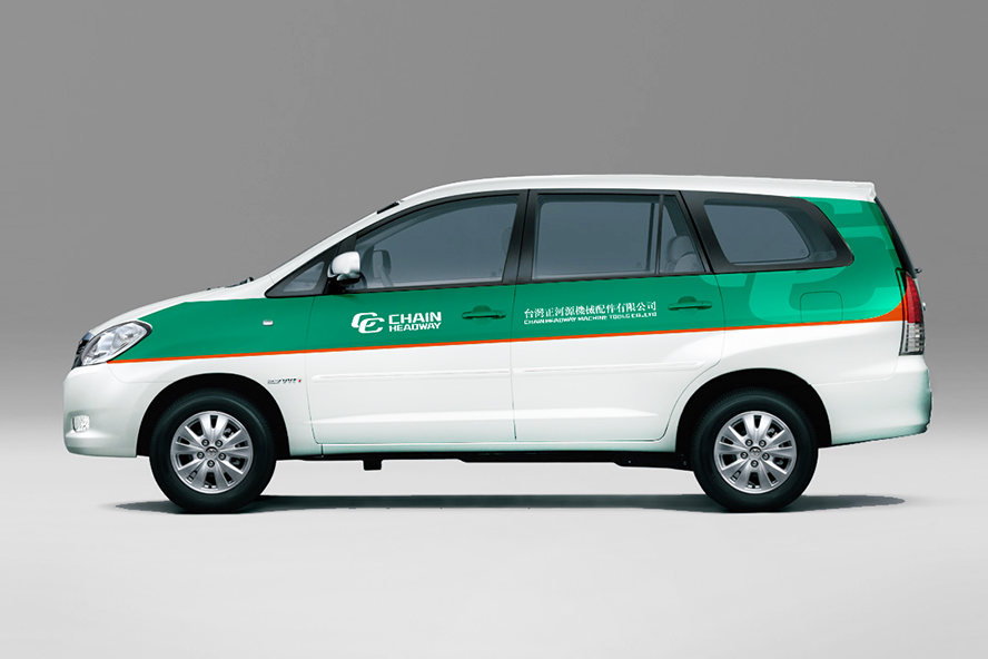
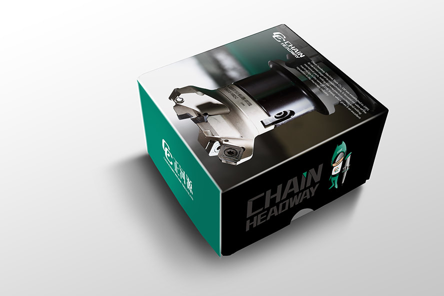
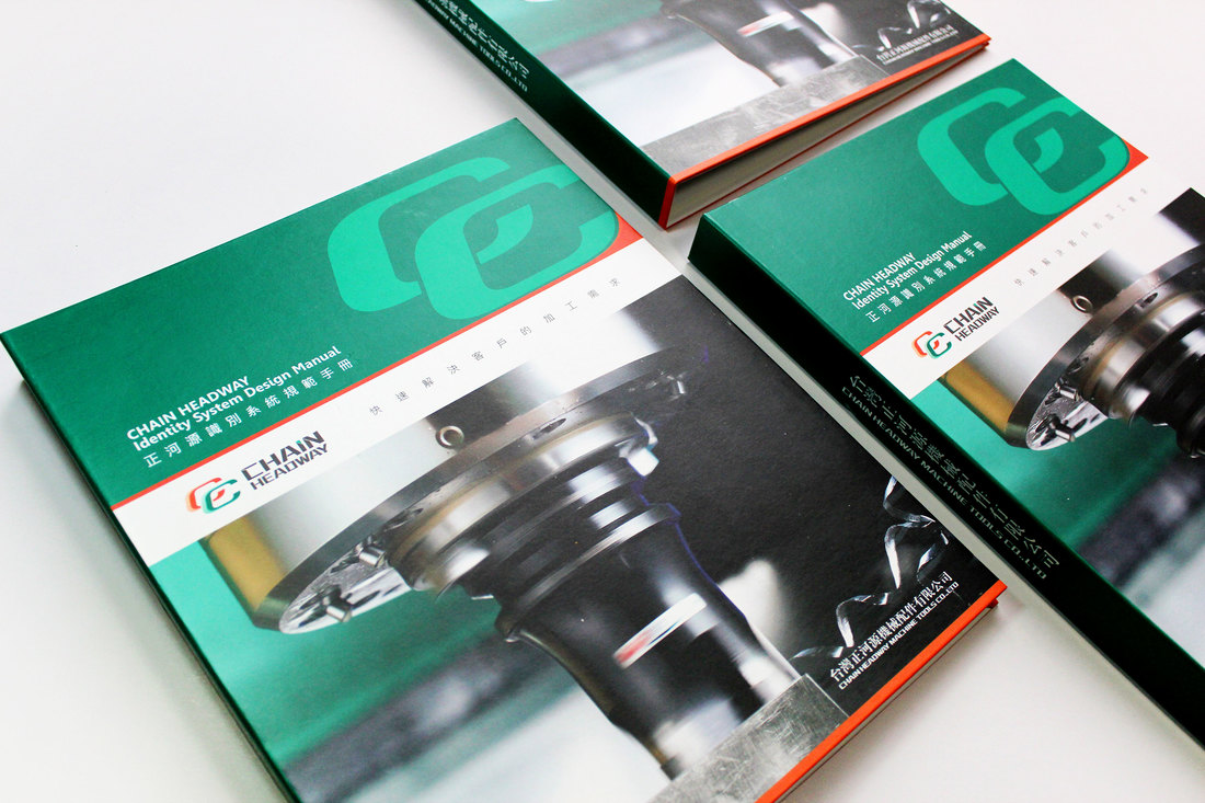
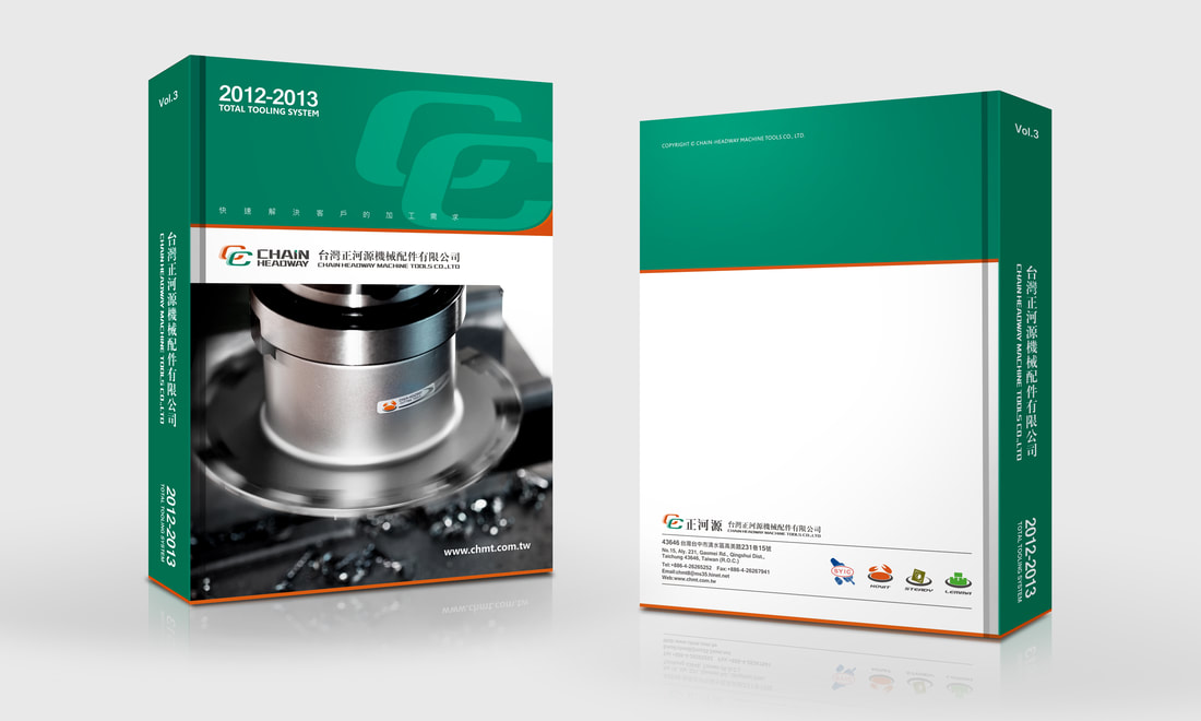
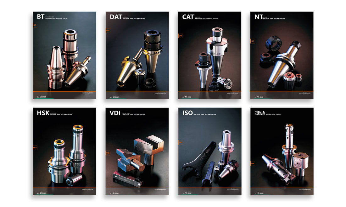
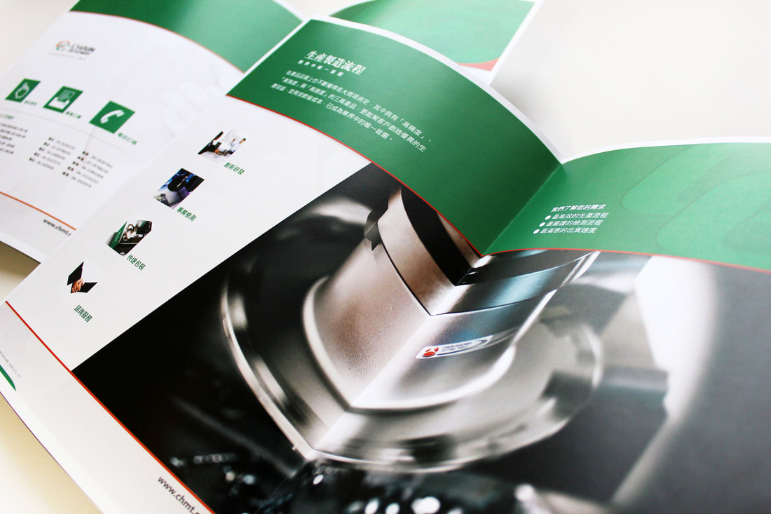
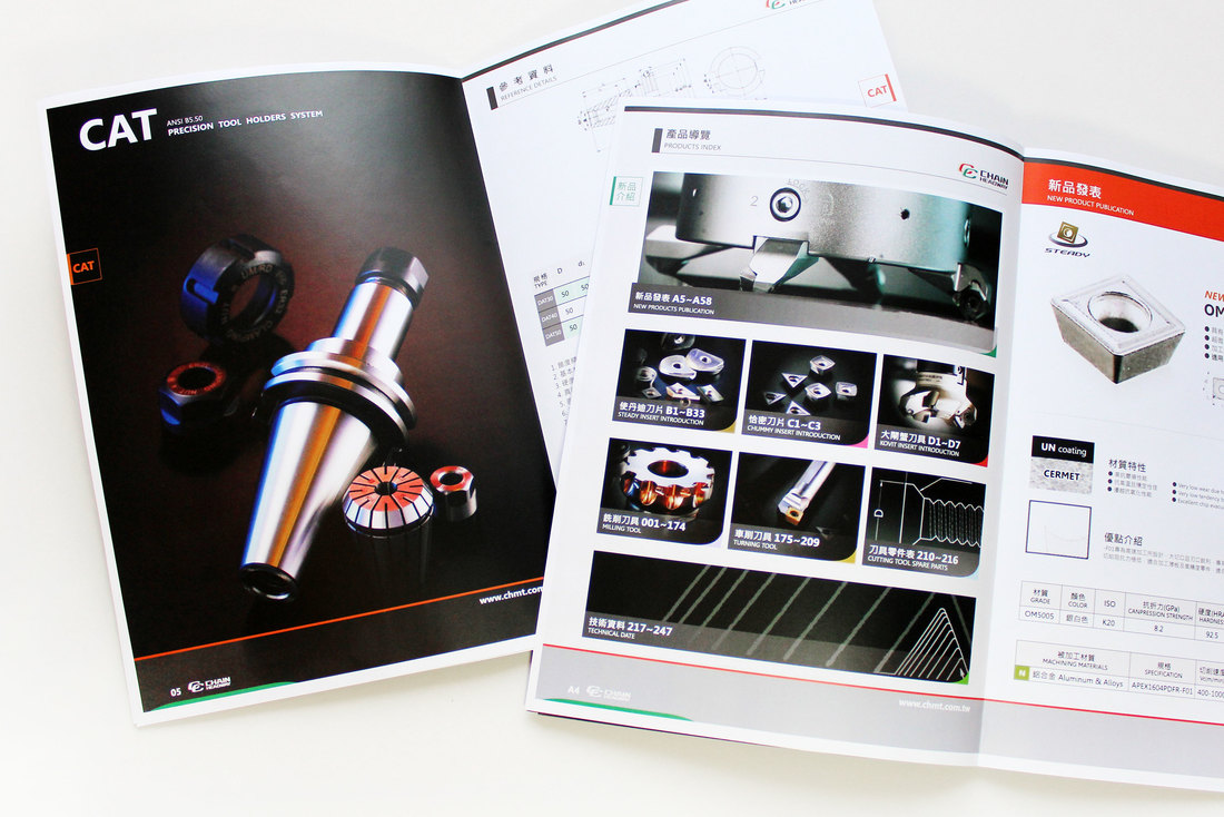
● 專案項目/ 品牌定位、企業識別設計、角色設計、應用系統(事務用品 / 簡報 / 制服 / 旗幟 / 包裝 / 車體 / 建築)、網站、產品目錄企劃設計、商業攝影規劃
● 品牌名稱/ Chain Headway
● 專案項目/ 品牌定位、企業識別設計、角色設計、應用系統(事務用品 / 簡報 / 制服 / 旗幟 / 包裝 / 車體 / 建築)、網站、產品目錄企劃設計、商業攝影規劃
MORE WORKS
安薪實業/ ACXING
|
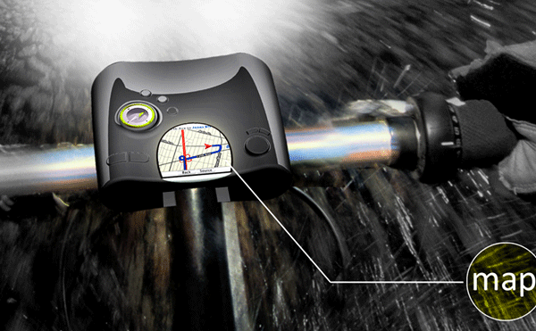
Path Finder
|
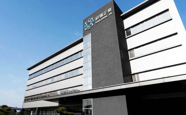
祥儀企業/ Sha Yang Ye
|
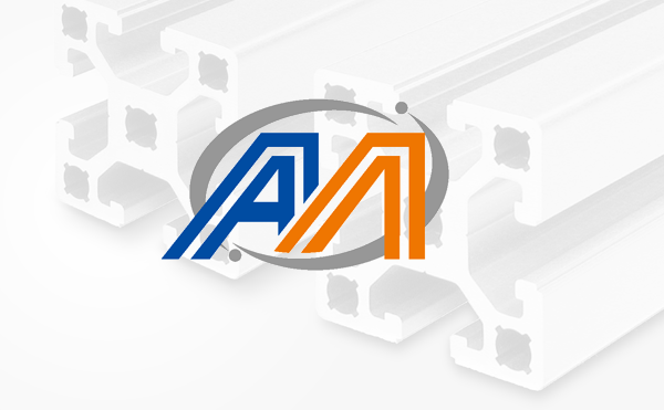
迅廣科技/ A-MODULAR
|